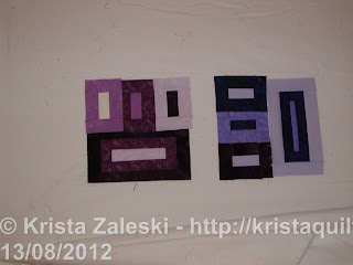
I'm not too sure about my design wall this week. I started a small quilt based on Judy's "Peaches and Dreams". But I'm having second thoughts. Now that I see them on the wall, my purples are divided into 2 distinct colour families - some are very blue, others are very red. And I don't think they are playing nicely together.
 If I split them up, the individual blocks are better, but I don't think I can put the two of them into the same quilt.
So, do I 1) give up, 2) make 2 quilts, or 3) soldier on and hope it goes to a colour-blind child? (Just kidding on that last one.) Or maybe I throw some more colours into the mix and see what Rainbow Dreams look like.
What do you think?

I think Rainbow Dreams sounds wonderful and I'd love to see it. Throw in some other colors!
ReplyDeleteYou know I actually love the look of it with all different types of purples in it.
ReplyDeletekathie L.
I'm with Kathie; I like the look of the different purples, too! :)
ReplyDeleteI'd throw in other colors to help the quilt live up to its billing of rainbow dreams. It will be gorgeous!
ReplyDeleteI think the way you've divided them into red and blue purples would be great if you carried on that way, and arranged them that way (alternating) in your quilt - assuming you've got even amounts of both...
ReplyDeleteMaybe by adding some pinks and/or greens you could have a Spring Rainbow?
ReplyDeleteIf you added in pinks and blues, it would all fit together. But, I think they all work together as it is, and will be even better once you get more done.
ReplyDeleteYou can make it analogous with the blue, the purple and adding some more purplish reds/pinks. I think it's great...I would just keep going and adding more!
ReplyDeleteI think by adding MORE purples, they WILL begin to play together and you can have the purple quilt you envisioned. Try to add some true violets (that are evenly balanced red+blue). Here and here are photos of a quilt I made from swap blocks that had a range of purples. If you look closely, you'll see that in many cases, blue-violet and red-violet fabrics ended up being adjacent in the finished quilt.
ReplyDeleteOf course, you could add more colors and that would work, too. I like Kathy's idea of an analogous colorway and would add some reds (but none that veer toward orange) and blues (same thing, no teals or anything leaning toward green).
I'm looking forward to seeing how you move this project forward.
Just keep going- it will turn out fine, the more shades of purple, the better.
ReplyDelete